Guidance on wedding stationery, etiquette, and the details that shape your guest experience.
Guidance on wedding stationery, etiquette, and the details that shape your guest experience.
the journal
Black and White Wedding Invitations for a Classic Ashford Acres Inn Wedding

Black and white wedding invitations set the stage for Audrey and Nathaniel’s Ashford Acres Inn wedding, which was a beautiful blend of Southern charm and modern design. Set against the historic backdrop of the Kentucky estate, their day was filled with thoughtful details that felt both elegant and personal. Their wedding started with black and white wedding invitations that went beyond the expected-simple, sophisticated, and tailored specifically to Audrey and Nathaniel. From there, every detail followed that same intentional approach. The venue, the flowers, the fashion—each element worked together to create a celebration that felt classic, personal, and effortlessly pulled together.
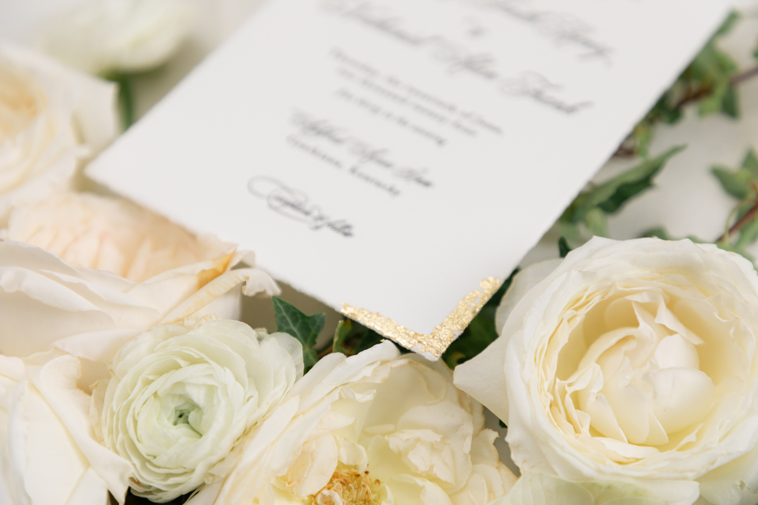
Join me as we explore the exquisite details of this remarkable Ashford Acres Inn wedding—and discover why this venue is such a beloved choice for couples seeking a blend of tradition, luxury, and Kentucky charm.
Ashford Acres Inn Wedding Venue
Audrey and Nathaniel’s Ashford Acres Inn wedding took place at one of Kentucky’s most charming historic venues. Nestled in the countryside of Cynthiana, Ashford Acres Inn offered the perfect balance of Southern elegance and comfort. The 1850s mansion, open event barn, and perfectly manicured grounds provided guests with ample space to enjoy during cocktail hour, creating an ideal backdrop for Audrey and Nathaniel’s celebration. With everything on site—from ceremony to reception to overnight accommodations—it allowed for a seamless, laid-back experience without sacrificing style or intention.
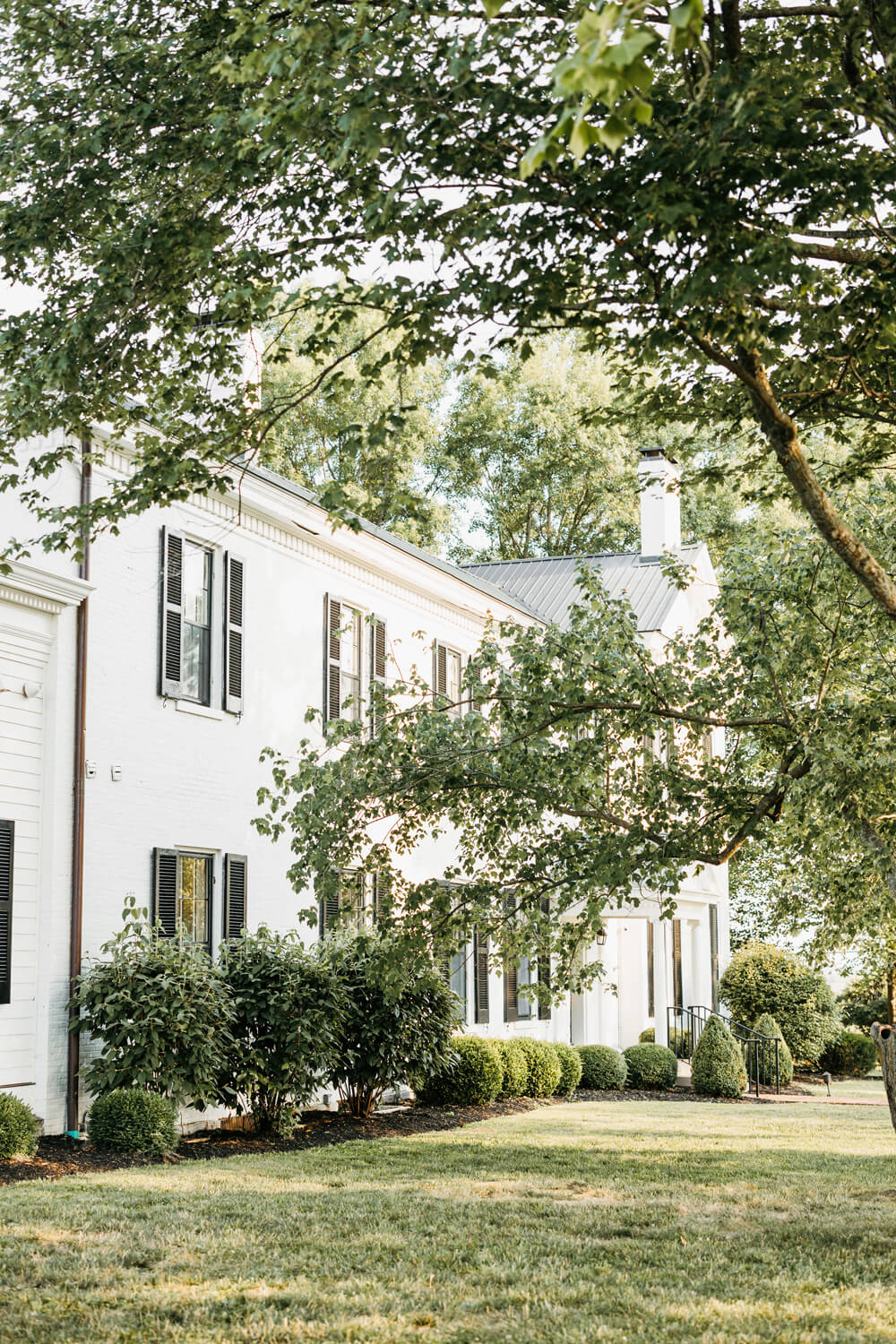

Black and White Wedding Invitations Created the Opening Scene
Audrey and Nathaniel’s black and white wedding invitations were more than just paper goods—they were the first expression of the day to come. It’s where anticipation took form, and their story began to speak. Audrey chose letterpress, a centuries-old form of printing known for its deep impression and tactile elegance, to create a suite that felt timeless and refined.
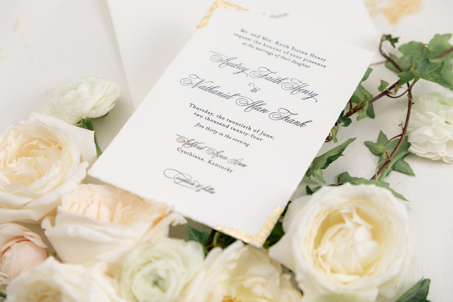
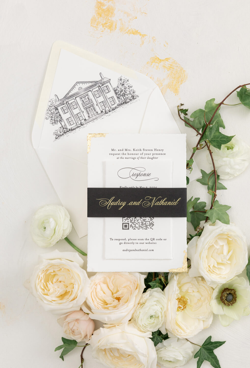
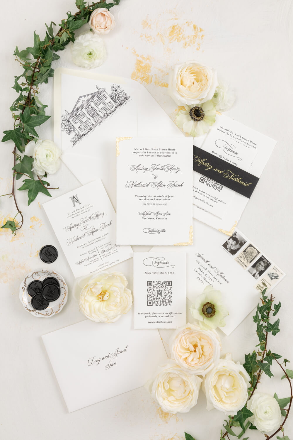

Designed with intentional, quiet beauty, each piece was letterpressed into soft cotton paper, with hand-torn edges and gold gilding in opposite corners. The envelope liner featured a custom illustration of Ashford Acres Inn, giving guests a glimpse of what was ahead. These thoughtful touches turned ordinary moments—like opening an envelope—into extraordinary memories. The suite carried a kind of subtle emotion their guests felt, even if they couldn’t quite explain why.
Bridal Party Style in Black and White Elegance
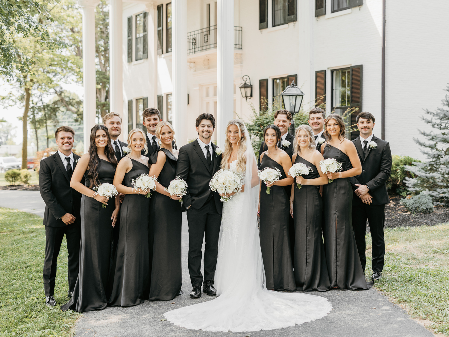
Audrey and Nathaniel’s bridal party perfectly reflected the timeless, modern aesthetic that carried through the entire day. The bridesmaids wore sleek, floor-length black satin dresses in a one-shoulder strapless style, each holding a bouquet of white roses and baby’s breath that softened the palette beautifully.

The groomsmen were just as polished in black suits and ties, with white boutonnieres that echoed the florals carried by the bridal party.
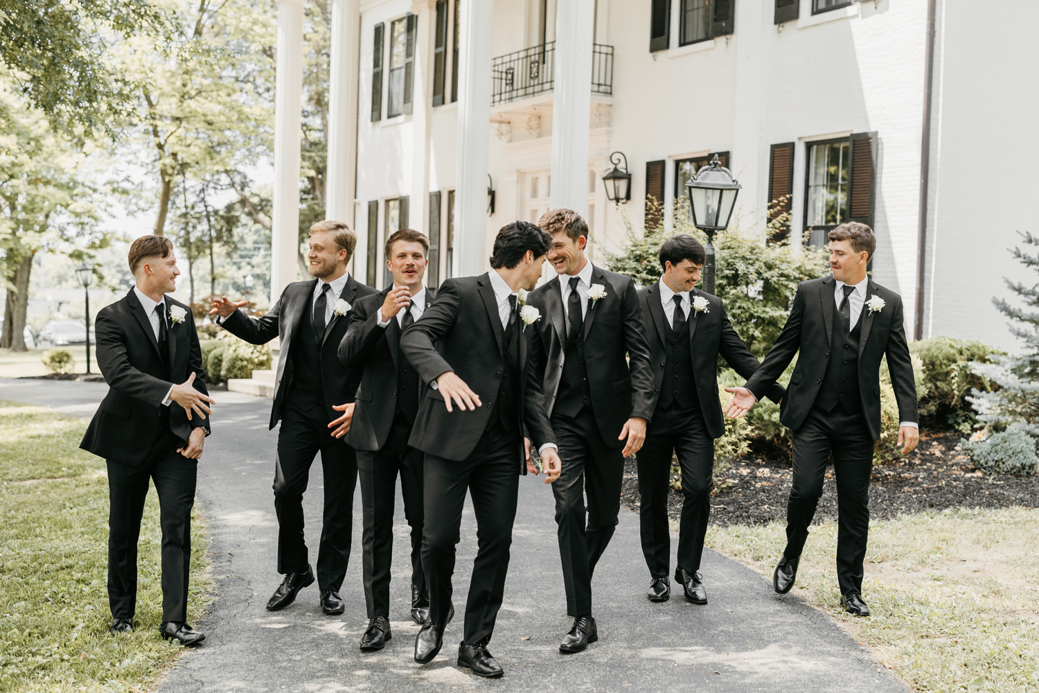
The black and white color scheme brought a sense of understated sophistication, while the natural greenery and historic columns of Ashford Acres Inn added a soft, romantic backdrop. Together, the group looked cohesive and classic—refined but never too formal.
A Ceremony Rooted in Faith and Intention
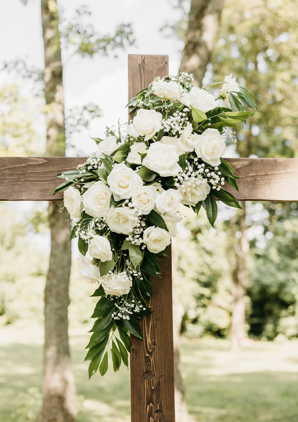
Audrey and Nathaniel’s ceremony was held in a quiet, shaded grove behind the Ashford Acres Inn mansion—peaceful, open, and deeply personal. Their shared faith was front and center, reflected in the wooden cross adorned with white roses and baby’s breath that stood as the backdrop for their vows.

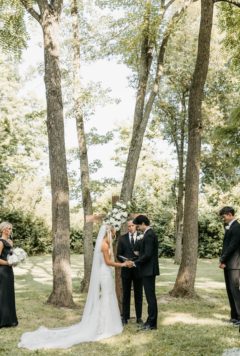
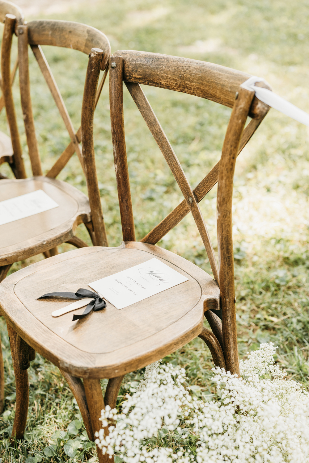
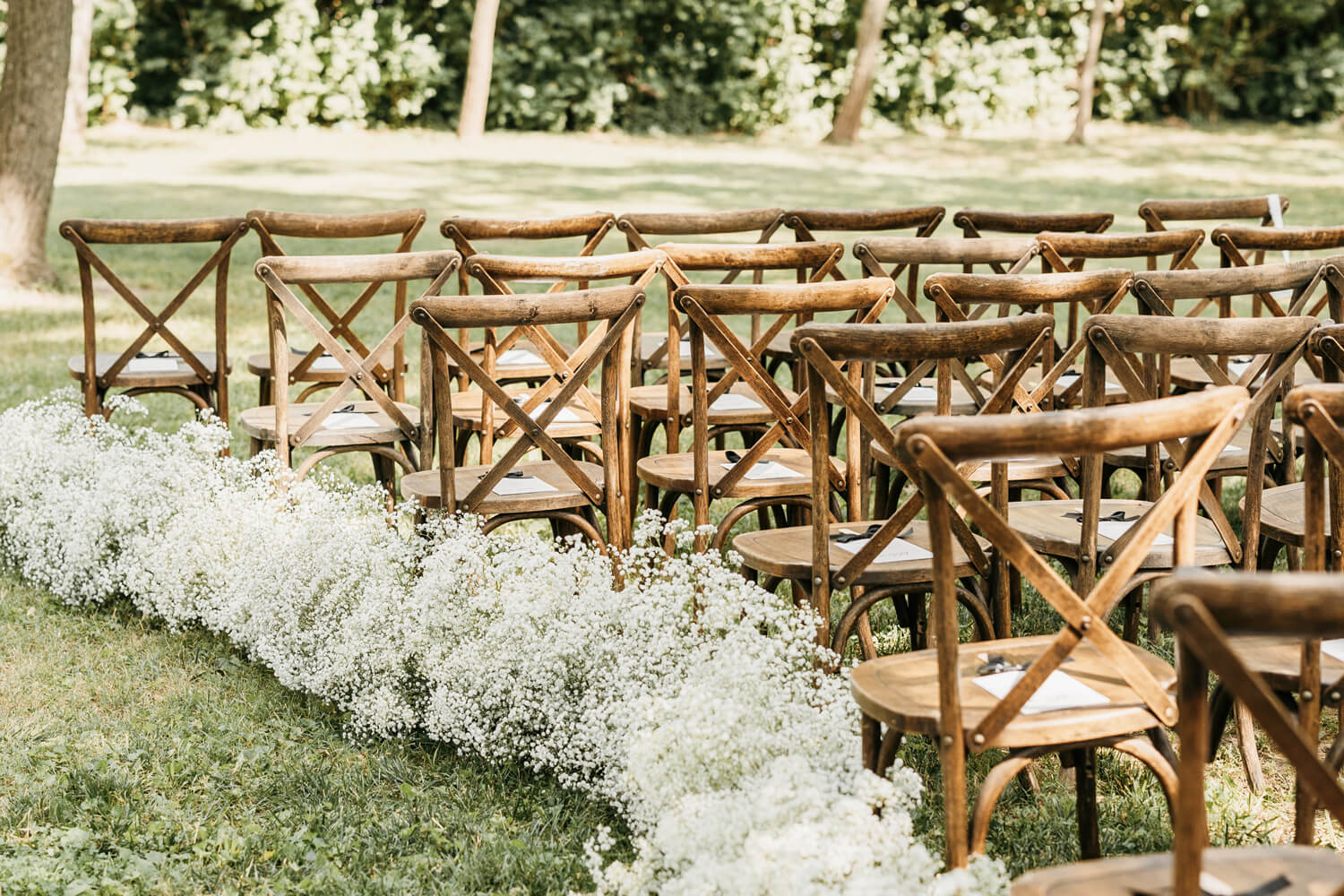
Guests were welcomed with a clean, modern sign at the ceremony entrance and black and white wedding programs tied with ribbon, resting neatly on rustic wooden chairs. Baby’s breath also lined the aisle, adding a soft, understated detail that worked perfectly with the outdoor space. Audrey and Nathaniel kept the ceremony focused on what mattered most to them—their faith and their commitment to each other.

A Reception That Tied Everything Together
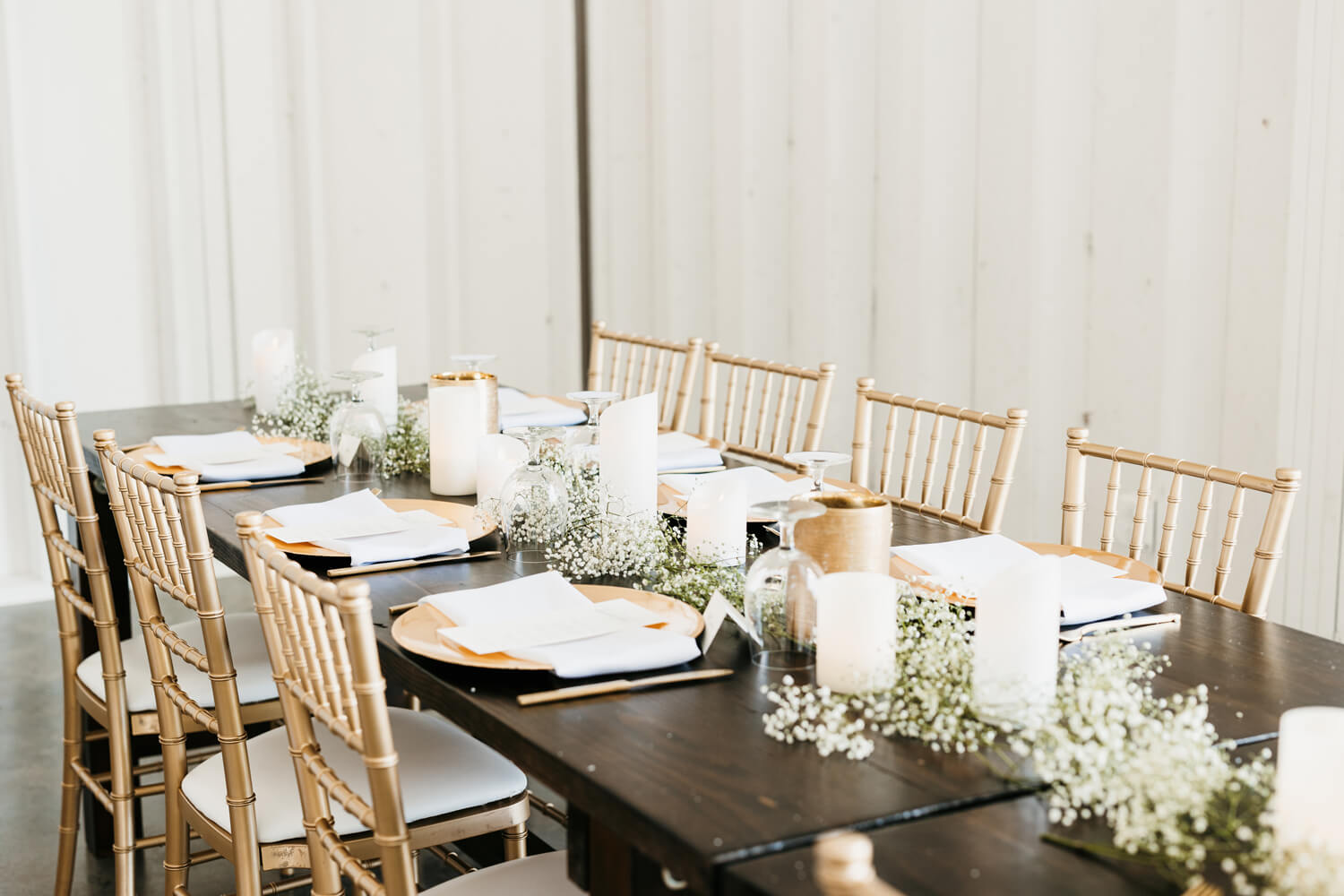
The theme that started with Audrey and Nathaniel’s black and white wedding invitations carried through every part of the reception. Guests gathered in the Event Barn, a bright, open space with high ceilings, exposed beams, and modern chandeliers that set the tone for a stylish, relaxed celebration.
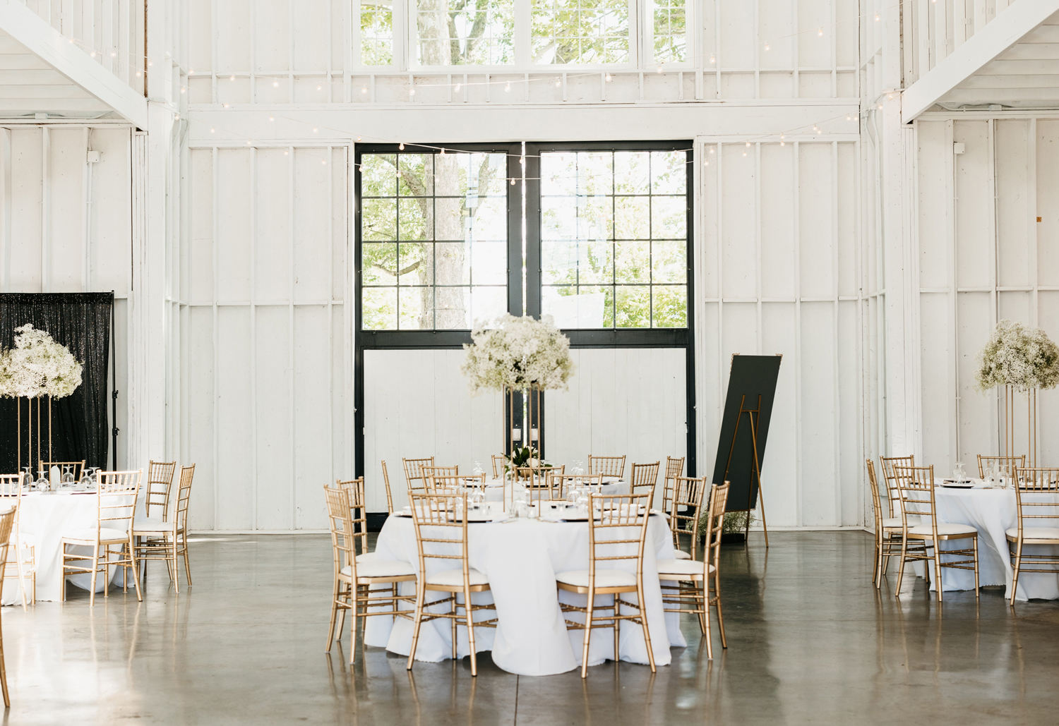
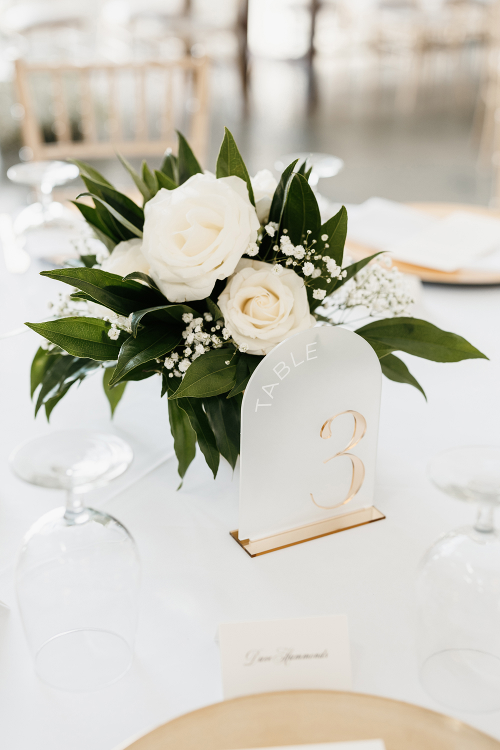
The reception decor was clean and cohesive, featuring white florals—mainly baby’s breath and roses—throughout the space. Tables were covered in crisp white linens, with round tables displaying tall gold stands filled with baby’s breath for added height and elegance. Gold accents provided the perfect amount of contrast against the white linens.


What started as an invitation design quickly grew into something much more. I had the opportunity to create all of their day-of stationery, including bar signage, thank-you notes, their welcome sign, wedding programs, and a mirror seating chart, all designed to maintain the same style and tone as their invitation suite. We kept the fonts, colors, and layout consistent so everything felt polished and intentional from start to finish.

“Janeil made the process so easy, yet so unique… She ended up doing much, much more. There is no way I would hire anybody but Seventh and Anderson.”
— Bobbie, Mother of the Bride
Signature Bar Menu
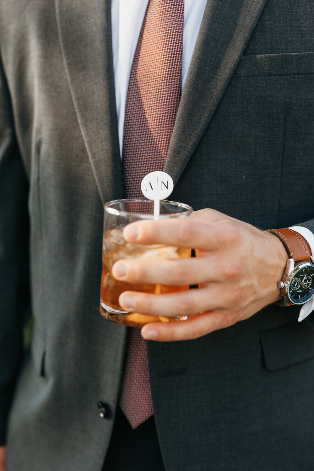
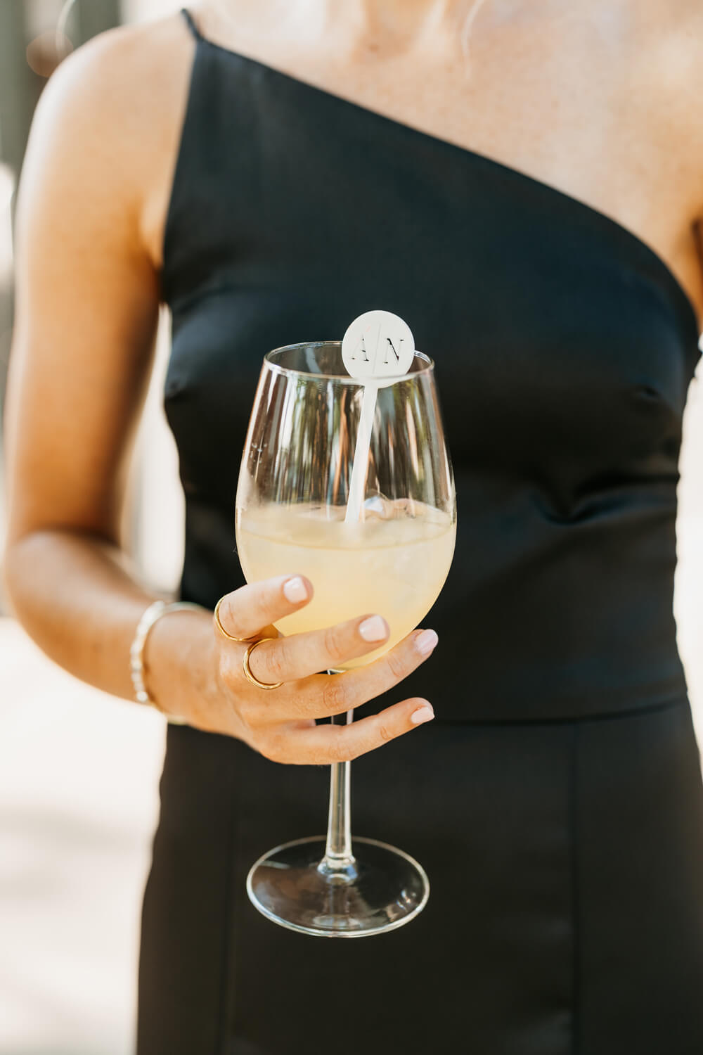
For the bar, I designed a custom black and white menu featuring Audrey and Nathaniel’s signature drinks: peach sangria for her and an old-fashioned for him. We also included personalized drink stirrers printed with their initials, which tied in perfectly with the rest of the suite.
As a stickler for details, I always work to ensure the drink illustrations closely resemble the actual cocktails being served. That level of accuracy might seem small, but it’s this level of detail that your guests will remember, even if they can’t explain why.

Mirror Seating Chart
For the seating chart, Candice (Audrey and Nathaniel’s planner) sourced a beautiful gold-framed mirror, and I created custom cards to layer over it. Each card was hand-torn and detailed with the same gold leaf accents we used on their invitation suite. We finished them with wax seals—using the exact same seal design from the invitations to keep everything visually connected.

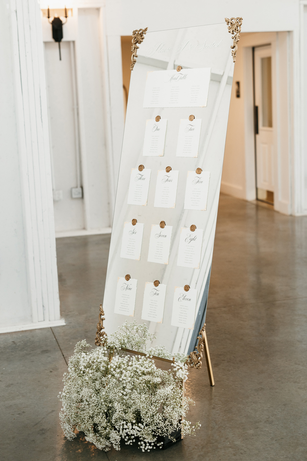
I always want day-of pieces to feel like a natural extension of the invitation suite, not an afterthought. This seating chart didn’t just serve a purpose—it became a standout moment. Candice placed it near the reception entrance, where it was both functional and beautiful.
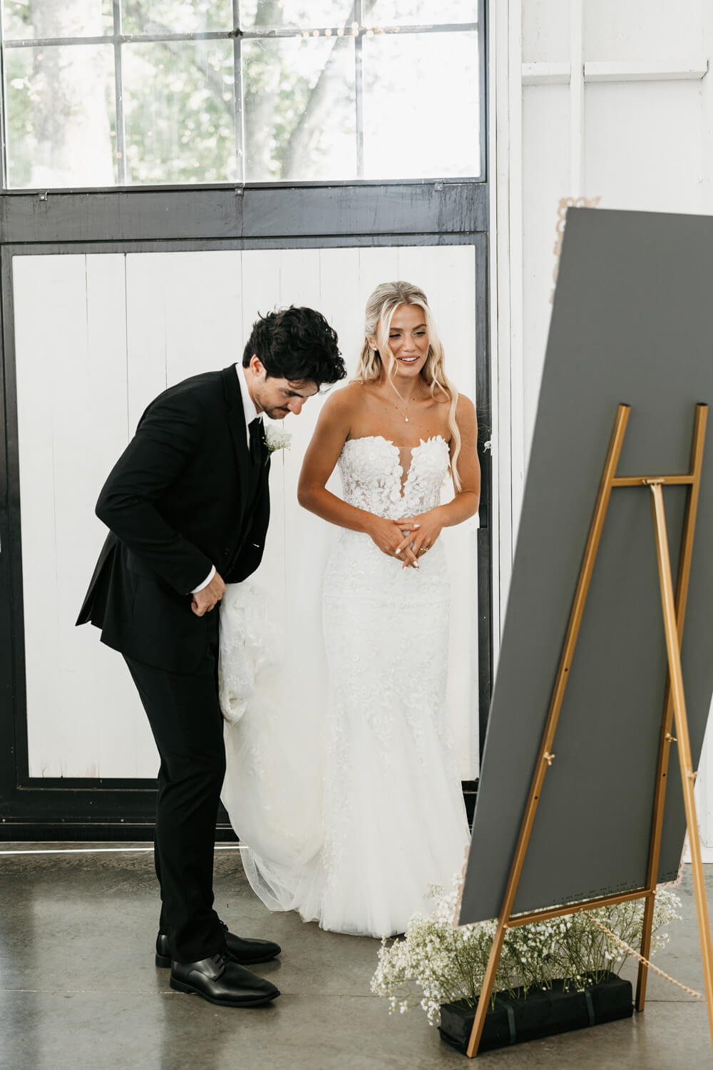
When Audrey and Nathaniel saw it for the first time, they stopped, smiled, and leaned in to take it all in. It was one of those moments where you could see the details landing—not just in their eyes, but in how they responded. That kind of quiet recognition is why I obsess over the little things.
A Stylish Celebration, from Ceremony to Sunset
Audrey and Nathaniel looked classic and completely in sync. Nathaniel wore a sharp black tux with a white rose boutonniere—clean, timeless, and right at home at Ashford Acres Inn. Audrey wore a lace-detailed gown with a structured silhouette and a soft bouquet of white roses and baby’s breath that echoed the rest of the floral design. Audrey changed into a white mini dress with a statement bow later in the day—an effortless choice for the reception and golden hour portraits.


A Celebration to Remember
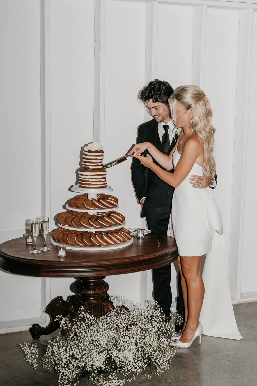
Once the formalities wrapped up, the energy shifted into full-on celebration mode. Audrey and Nathaniel cut into a unique dessert display—an impressive tower of cookies topped with a petite naked cake. Once the music started, the dance floor filled up fast—guests threw on their party shades, grabbed glow sticks, and went all in. With “The Franks” glowing in giant marquee letters, the whole space felt like one big celebration.



Let’s not settle for just “pretty.” Audrey and Nathaniel’s Ashford Acres Inn wedding is the perfect example of what happens when every detail is intentional. Their black and white wedding invitations set the stage, but it didn’t stop there—from bar signage to day-of details, everything felt connected, personal, and elevated. It’s a great example of how even simple choices can have a big impact when designed intentionally.
And when you’re planning something this meaningful, you deserve more than just pretty paper. You deserve something show-stopping, unique, and completely you. Because iconic celebrations don’t start with a generic first impression—they begin with paper that speaks. Through texture, typography, and the quiet little details no one can quite explain, but everyone can feel.
Am I speaking your language? Grab a spot on my calendar here. I’d love to hear what you’re dreaming up!
See Audrey and Nathaniel’s full gallery HERE.
This wedding was featured on Kentucky Bride.
Vendor Team
Venue + Catering: Ashford Acres Inn
Planning + Design: Candice Ford Event Design
Photography: Addie Fresca Photography
Videography: Logan’s Lens Productions
DJ: Elite Events and Entertainment
Makeup: Lashira Davidson Makeup
Hair: Bangs and Blush
Second Dress: Anthropologie Weddings
Groom’s Attire: Geno’s Formal Affair
Stationery/Signage: Seventh and Anderson
Floral: Doug Smith Design and Events
Marquee Letters: Alpha-Lit Lexington
Rentals: Bryant’s Rent-All
Cookie Cake: Martine’s Pastries
Ice Cream: Crank & Bloom
NEXT POST
back to post index
PREVIOUS POST
Learn when to order, design, and mail each piece for a seamless stationery experience. From save-the-dates to thank you cards, this guide helps you plan early, avoid rush fees, and create a guest experience that feels intentional from the very first envelope.
The Wedding Stationery Checklist Every Couple Should Follow
stationery guide
My brother and I grew up with a front row seat to what true, long-lasting love looks like. This is the story of our parents' golden anniversary, a celebration that didn't just mark a milestone but also honored them and the legacy they created.
Celebrating 50 Years of Love: Our Parents' Golden Anniversary
CELEBRATIONS
Some wedding days dazzle with their beauty. Others draw you in quietly, through thoughtful choices and meaningful details. Lili and Killian’s Moonlight Basin wedding was the latter.
Floral Wedding Invitations for a Summer Wedding at Moonlight Basin.
WEDDINGS
THE JOURNAL
a few favorites from
— katie & xander
This is the third message we've received from family and friends regarding our invitation design, after sending our invites out just a week ago. It's hard enough these days getting people to return their RSVPs for weddings, but to have people go out of their way to compliment the details, is incredible. Janeil with Seventh and Anderson is the fairy godmother of paper products, she gets to know you and your partner, takes your ideas/likes/dislikes into account, and creates stunning work you could never have dreamed of.
This is the third message we've received from family and friends regarding our invitation design, after sending our invites out just a week ago. It's hard enough these days getting people to return their RSVPs for weddings, but to have people go out of their way to compliment the details, is incredible. Janeil with Seventh and Anderson is the fairy godmother of paper products, she gets to know you and your partner, takes your ideas/likes/dislikes into account, and creates stunning work you could never have dreamed of.
“Your wedding invites are the most beautiful things I’ve ever seen.”
When the details start to matter.
If this post had you thinking differently about your invitations, you’re exactly where you need to be. Wedding stationery isn’t an afterthought here; it’s part of how your guests experience the entire celebration.
If you’re ready to approach your invitations with intention and clarity, I’d love to hear what you’re planning.
comments +