Guidance on wedding stationery, etiquette, and the details that shape your guest experience.
Guidance on wedding stationery, etiquette, and the details that shape your guest experience.
the journal
Bold Jewel Tone Wedding Invitations: Burgundy and Purple Wedding Inspiration

Jewel tone wedding invitations lay the foundation for a bold, artful aesthetic that’s especially captivating for fall or winter celebrations. Jewel tones are having a major moment in the world of weddings, and for good reason—they bring richness, depth, and personality that’s hard to match. If you’re dreaming of a burgundy and purple wedding or simply want to infuse your day with moody, memorable colors, your invitations are the perfect place to begin.

I collaborated on a wedding inspiration shoot at the Billings Rimrocks in Billings, Montana, designed to show how impactful jewel tone wedding invitations can be. From the invitation suite to the bouquet, cake, and every detail in between, we wove rich, vibrant colors throughout. Keep reading for a dose of bold, beautiful inspiration you can make your own.
Why Jewel Tones Make a Statement
Jewel tones—think emerald, sapphire, amethyst, and burgundy—are inspired by the rich hues of precious gemstones. Unlike pastels or neutrals, these colors bring a level of depth and drama that lighter palettes simply can’t match. For couples planning a burgundy and purple wedding, jewel tones offer a bold, expressive style while still feeling timeless. They work beautifully in every season but especially shine in fall and winter celebrations. Most importantly, they create space for your personality to shine—adding mood and richness to your wedding invitations, sparking anticipation, and setting your story in motion.
Jewel Tone Wedding Invitations with Rich Detail and Texture
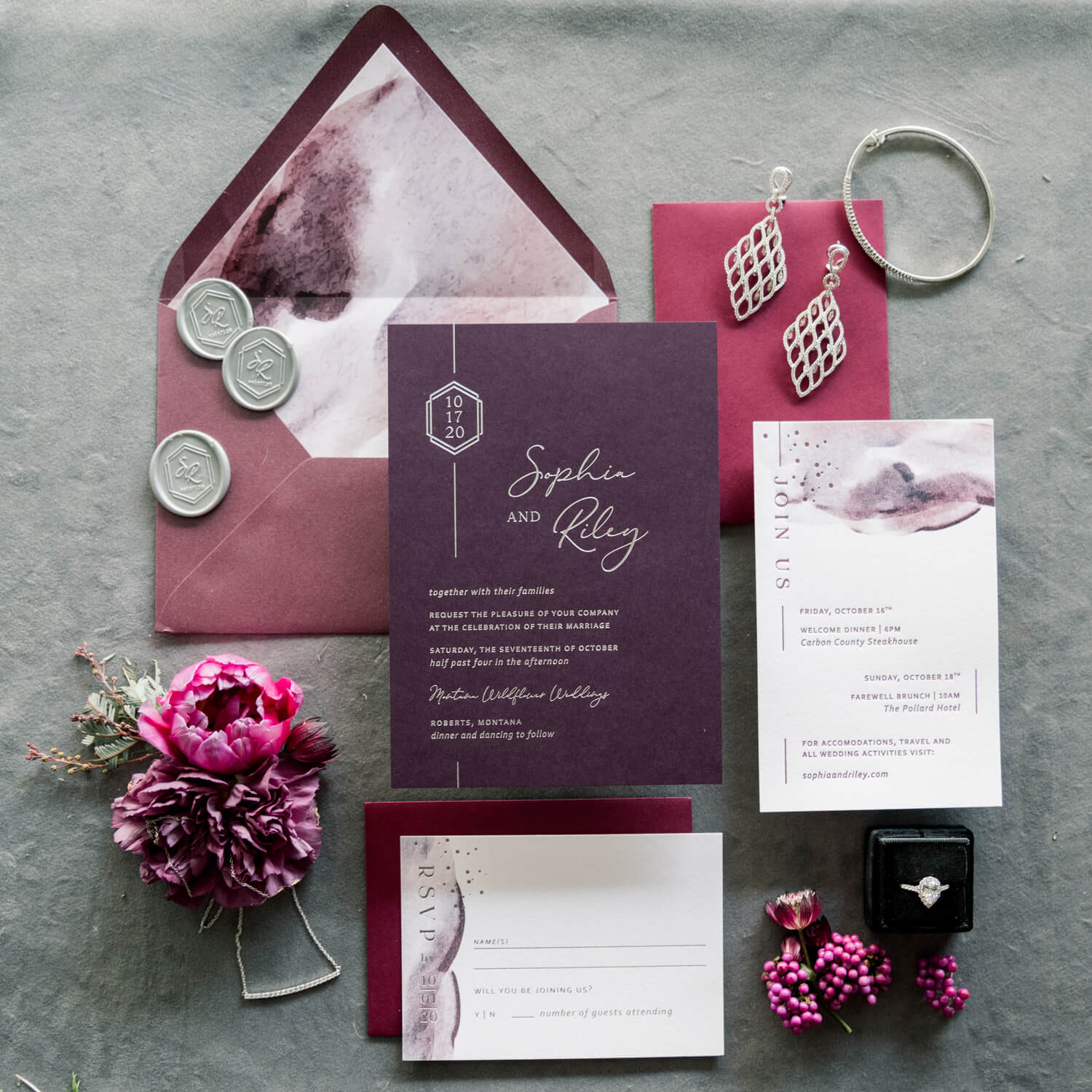
I wanted the invitation suite to be a true showstopper for this wedding inspiration shoot—and it delivered. Designed to capture the depth and sophistication of a jewel tone wedding, the suite combined rich color, layered textures, and intentional detail throughout.
The main invitation featured silver foil stamping on deep purple coverstock, offering a luxe, moody finish with just the right amount of shine. It was paired with burgundy envelopes, marbled watercolor liners, and finished with custom wax seals wrapped in black leather twine—a detail that added both edge and elegance.


The RSVP and itinerary were printed using a mix of letterpress and digital watercolor elements, creating a balance of modern artistry and tactile appeal. From the paper choices to the color palette, each element echoed the mood of a burgundy and purple wedding—striking, expressive, and undeniably chic.

The final result? A suite that didn’t just show off pretty paper – it imagined the kind of wedding that is bold, colorful, and impossible to forget.


Burgundy and Purple Wedding Florals That Make a Statement
Jewel tone wedding invitations don’t have to stand alone—they can inspire the entire look of your wedding day. In this wedding inspiration shoot, the floral design took cues directly from the invitation suite. The bridal bouquet mirrored the stationery’s palette with velvety burgundy dahlias, purple lisianthus, rich ranunculus, and deep green foliage, all tied together with flowing black and mauve ribbons for contrast.
Field and Frond carried that same bold energy throughout the shoot—from the moody arrangement on the peacock chair to the groom’s lavender boutonnière, which stood out perfectly against his black leather jacket. These jewel tone florals brought cohesion to the styling without feeling matchy or expected.


If you’re working with a florist, share your invitation suite early in the process—it’s a great visual reference that can help tie everything together, from your bouquet to your ceremony aisle.
Jewel Tone Wedding Cake That’s Almost Too Pretty to Slice
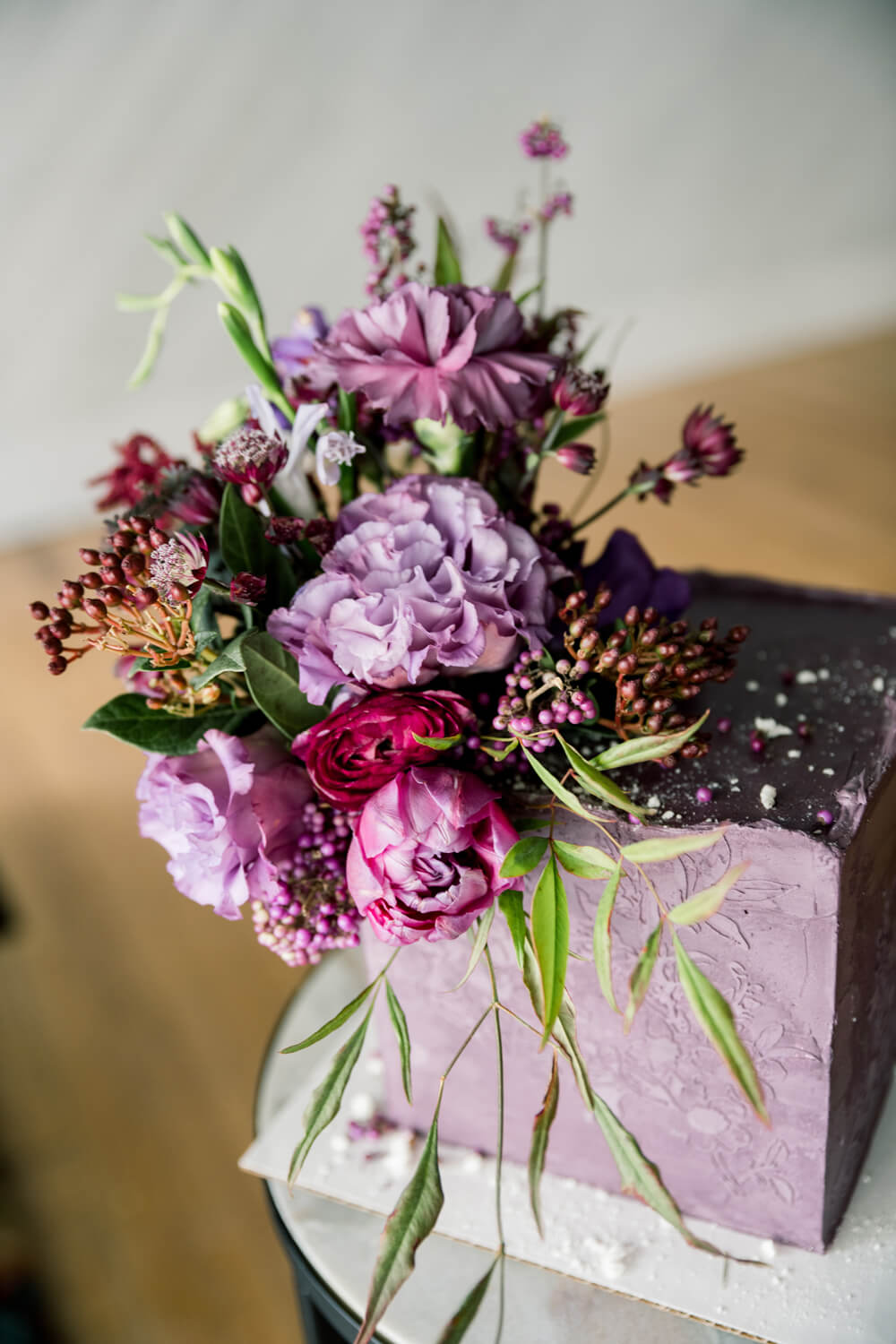
The cake design for this jewel tone wedding inspiration shoot was anything but typical. Instead of the traditional white-tiered look, Sweets by Sam created a square, single-tier cake that brought serious style with a matte plum buttercream finish and a subtle floral-textured imprint. What really made it stand out, though, was the floral installation cascading from the top—featuring lisianthus, ranunculus, peonies, and pepper berries in the same moody hues seen throughout the day. It was a perfect example of how your wedding cake can tie into your color palette and add personality to your reception setup without feeling overdone or expected.


Edgy Elegance: Jewel Tones Meet Leather and Lace
True to Montana, we experienced an unexpected snowfall, and while the motorcycle didn’t make it into the shoot, the couple’s styling still delivered bold, badass energy. The bride’s look fused romance with rock ‘n’ roll—think flowing ivory dress, black leather jacket, and a wide-brimmed hat. Her makeup was classic with a twist: a deep berry lip and glowing skin that perfectly complemented her jewel-toned bouquet. Sparkling chandelier earrings and a beaded hair comb added vintage glam, while her manicure featured moody maroon and hand-painted leafy details for a modern nod to the season. The groom echoed the edgy vibe in a black leather jacket paired with a crisp white shirt, made wedding-day ready with a lavender boutonnière. This shoot proved that a little snow can’t stop love—or style.


Expert Tips for Styling a Jewel Tone Wedding Color Palette
Thinking about using a jewel tone wedding color palette for your big day? Here’s how to make these rich, romantic shades feel intentional and elevated from invitations to decor:
- Start with a Core Palette: Choose two or three main jewel tones—like burgundy, plum, or emerald—and let them guide your stationery, florals, and styling.
- Layer in Metallics: Metallic accents—like gold foil, copper wax seals, or brushed bronze details—can add warmth and just the right amount of shine to your overall look.
- Balance Bold Colors with Neutrals: Pair deeper shades with softer tones like cream, blush, or muted gray. It keeps things grounded and lets your jewel tones stand out without feeling heavy.
- Make It Personal: Add thoughtful elements like textured paper, custom monograms, or a quote from your vows to make your wedding suite feel uniquely yours.
- Work with a Custom Stationer: At Seventh and Anderson, my goal is simple: to design wedding stationery that feels like you—classic, distinctive, and full of heart.
From Pinterest Board to Polished Suite: How I Help You Design Jewel Tone Wedding Invitations
Turning inspiration into reality can feel overwhelming—but it doesn’t have to be. At Seventh and Anderson, I work with couples to shape their ideas—whether a color palette, a favorite floral, or a mood board full of jewel tones—into a cohesive, polished stationery suite. Whether you’re just starting to plan or already knee-deep in details, I’m here to help you design jewel tone wedding invitations that feel intentional, personal, and completely yours. From your save-the-dates to day-of pieces, I’ll ensure every element reflects your style and sets the tone for the celebration ahead.
Ready to bring your ideas off the screen and into your hands? Book a consultation, and let’s start the conversation.
Vendor Team
Photography: Tabby Miller Photography
Cake: Sweets by Sam
Makeup: Sarah Lowther Beauty
Nails: Midnight Nails by Maria
Dress + Hair Accessory: Step’n Out
Stationery: Seventh and Anderson
Floral: Field and Frond
Hair: Fresh Hair MT
Jewelry: Riddles Jewelry
If you have any questions or need extra guidance, don’t hesitate to reach out—I’m here to help! Just email me directly at janeil@seventhandanderson.com or message me via my Contact Page, and I’ll be back in your inbox with a response in no time.
Not sure how many invitations to actually order? Check out this post where I break it all down—because, trust me, it’s fewer than your guest count but more than you think.
Looking for inspiration? Explore my Portfolio to see how past couples have transformed their vision into beautifully crafted invitations.
NEXT POST
back to post index
PREVIOUS POST
Learn when to order, design, and mail each piece for a seamless stationery experience. From save-the-dates to thank you cards, this guide helps you plan early, avoid rush fees, and create a guest experience that feels intentional from the very first envelope.
The Wedding Stationery Checklist Every Couple Should Follow
stationery guide
My brother and I grew up with a front row seat to what true, long-lasting love looks like. This is the story of our parents' golden anniversary, a celebration that didn't just mark a milestone but also honored them and the legacy they created.
Celebrating 50 Years of Love: Our Parents' Golden Anniversary
CELEBRATIONS
Some wedding days dazzle with their beauty. Others draw you in quietly, through thoughtful choices and meaningful details. Lili and Killian’s Moonlight Basin wedding was the latter.
Floral Wedding Invitations for a Summer Wedding at Moonlight Basin.
WEDDINGS
THE JOURNAL
a few favorites from
— katie & xander
This is the third message we've received from family and friends regarding our invitation design, after sending our invites out just a week ago. It's hard enough these days getting people to return their RSVPs for weddings, but to have people go out of their way to compliment the details, is incredible. Janeil with Seventh and Anderson is the fairy godmother of paper products, she gets to know you and your partner, takes your ideas/likes/dislikes into account, and creates stunning work you could never have dreamed of.
This is the third message we've received from family and friends regarding our invitation design, after sending our invites out just a week ago. It's hard enough these days getting people to return their RSVPs for weddings, but to have people go out of their way to compliment the details, is incredible. Janeil with Seventh and Anderson is the fairy godmother of paper products, she gets to know you and your partner, takes your ideas/likes/dislikes into account, and creates stunning work you could never have dreamed of.
“Your wedding invites are the most beautiful things I’ve ever seen.”
When the details start to matter.
If this post had you thinking differently about your invitations, you’re exactly where you need to be. Wedding stationery isn’t an afterthought here; it’s part of how your guests experience the entire celebration.
If you’re ready to approach your invitations with intention and clarity, I’d love to hear what you’re planning.
comments +