The Art of Cohesive Wedding Details: Why Your Paper and Decor Should Work Together
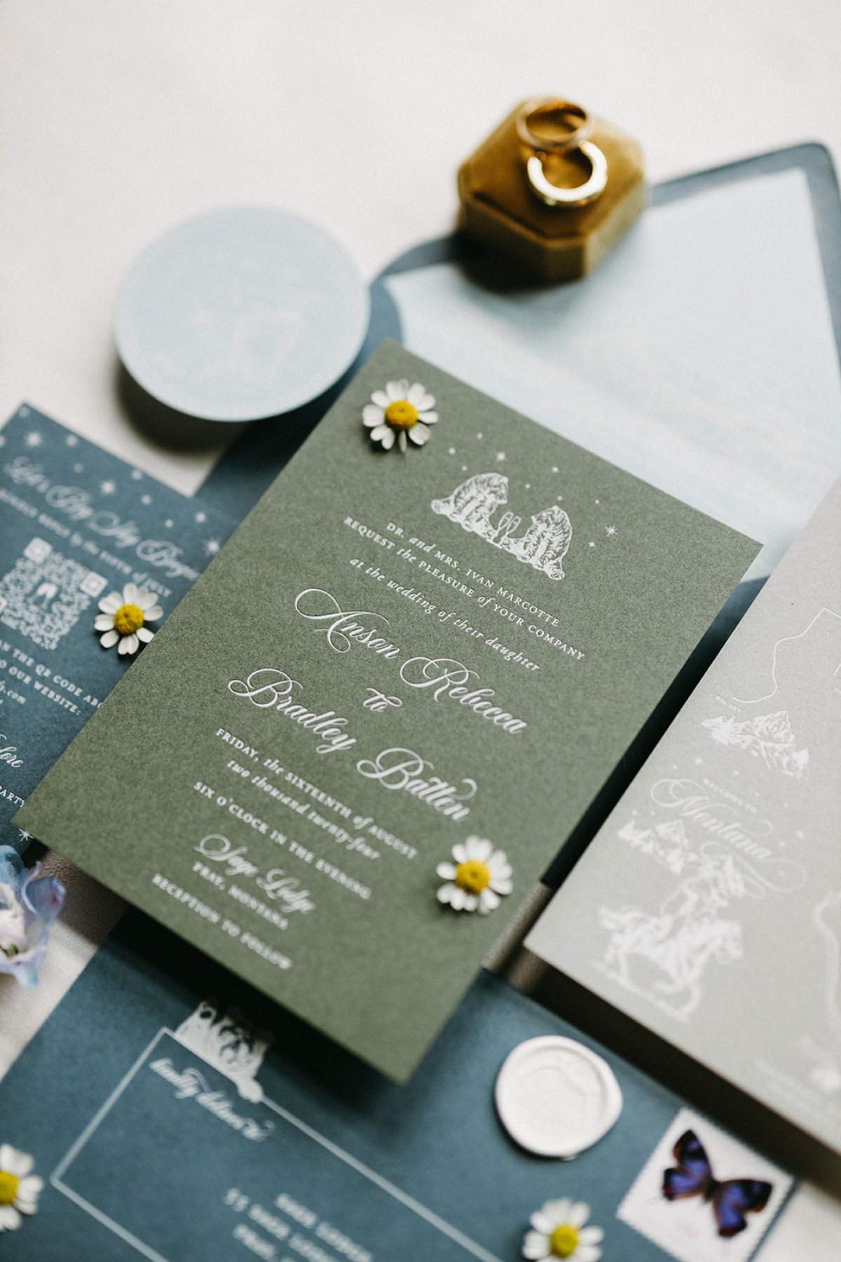
There is a moment at every wedding when everything feels perfectly in sync. Guests step into the ceremony or reception and immediately understand the atmosphere because all of your wedding details: the colors, textures, florals, lighting, and paper all speak the same visual language. That harmony isn’t accidental. It’s the result of thoughtful cohesion.
Cohesion isn’t about making everything match. It’s about clarity; guiding your guests through an experience that feels intentional and connected, where each design choice supports the next. When it’s done well, they don’t stop to analyze it; they simply feel it.
This is the lens I bring to wedding stationery at Seventh and Anderson. From my Montana studio, I design paper details that are considered alongside your entire celebration, not added as an afterthought. The goal is simple: stationery that supports the overall experience and leaves a lasting impression. If this approach resonates, you’re welcome to inquire anytime and explore what it could look like for your own wedding.
Cohesion Is the Difference Between Polished and Scattered
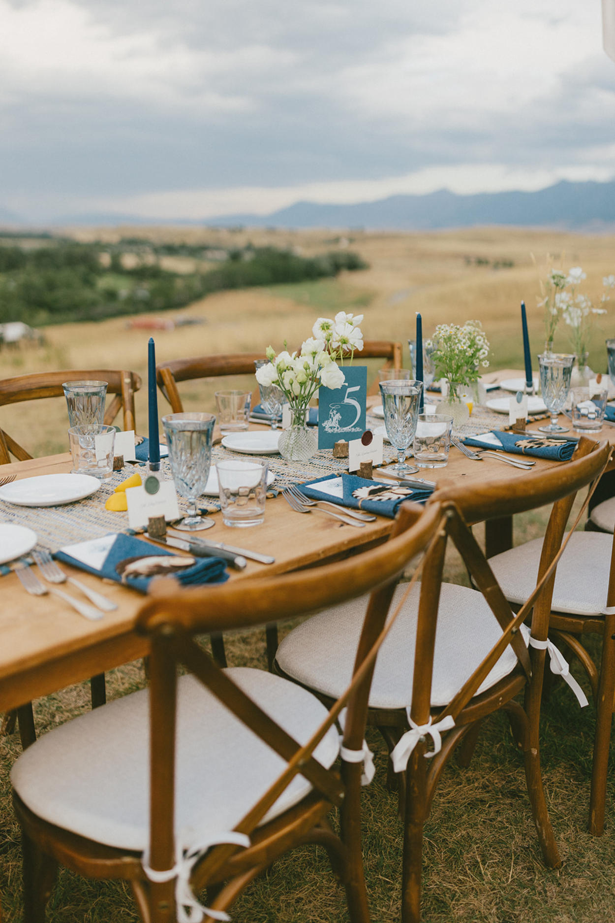
Cohesion rarely breaks because of one bad choice in your wedding details. It breaks when design decisions are made in isolation.
A couple falls in love with an invitation style. Later, florals move in a different direction. Tablescapes evolve again. Individually, each choice is beautiful. Together, they create visual noise. Guests may not be able to explain what feels off, but they sense it immediately.
This is where stationery is often overlooked. Invitations are treated as a box to check rather than the first design choice. In reality, they should lead. Your paper sets the tone, formality, and palette, giving every creative partner a clear reference point to build from.
When invitations lead the design conversation, cohesion becomes easier. Decisions feel clearer. Planning fatigue eases. Instead of second-guessing whether something fits, you’re working from a defined visual language that carries through the entire celebration.
That’s the difference between a wedding that looks polished and one that feels scattered. Cohesion isn’t about doing more; it’s about letting the right wedding details guide everything else.
Your Invitations Set the Foundation
Your invitations set the foundation for everything that follows. Before guests ever see the venue or florals, they experience the celebration’s mood through paper, typography, tone, and restraint.
Wedding details like texture, spacing, edges, and ink choice quietly communicate formality and mood. They give guests context. They create expectation. And they offer the first sense of how thoughtfully the day has been planned.
This is my standard. Invitations aren’t just informational, they’re directional. When the foundation is clear, every other design decision has something solid to build on, and the experience unfolds with ease.
For a simple way to keep every piece aligned from the start, my blog “The Wedding Stationery Checklist Every Wedding Couple Should Follow” walks you through all the essentials in one place. It is a helpful starting point for stress-free planning.
How Paper Influences Event Day Design
Wedding paper works best when designed alongside the rest of the day. A suite built from soft greens, cotton stock, and a watercolor illustration doesn’t stop at the envelope. It flows to menus, signage, table numbers, and seating charts.
When designing a suite, I think ahead to the wedding day: how colors look under different lighting, how paper pairs with florals and linens, and how scale and materials appear. Even a small place card can influence mood when it’s part of a consistent visual language.
If you’re navigating timelines or wondering how all these pieces fit together, consider this a reminder that support is available. My Wedding Stationery Timeline guide offers a clear, steady framework for what happens when, so the creative decisions can feel thoughtful rather than rushed.
How Decor Completes the Story
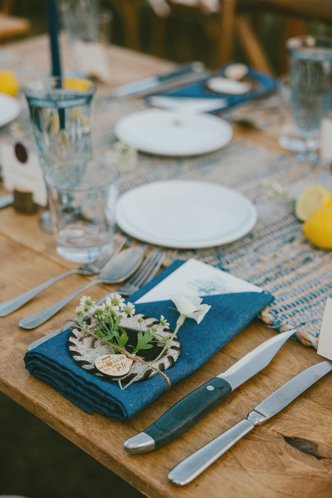
Decor is where your wedding details begin to surround your guests. Florals, tablescapes, lighting, and signage don’t shift the story; they reinforce what’s already been established through paper.
Cohesion doesn’t mean everything matches. It means materials and textures are speaking the same language. A suite printed on soft cotton with simple typography pairs naturally with structured floral arrangements, tailored linens, and clean lines. Paper with deckled edges, layered ink, or silk ribbon finds its counterpart in textured florals, candlelight, and materials that feel collected rather than styled.
When decor aligns with the stationery’s tone, every wedding detail feels intentionally considered. Nothing competes. Nothing feels added. Each element simply belongs.
The Power of Repeating Visual Motifs
Repeating a single motif is one of the most effective ways to create cohesion. When used with restraint, it becomes the quiet thread that holds everything together.
Take a custom venue illustration. Introduced on the invitation, it can reappear on a ceremony program, guide a seating chart, or anchor a welcome sign. Each time it feels familiar, never repetitive. The motif maintains continuity without explanation.
This kind of repetition isn’t decorative. It’s strategic. One thoughtful element, carried through with intention, steadies the entire visual experience and makes the design feel complete.
If cohesive design matters to you, you might love my blog “How to Choose a Stationery Designer When You Want Something Truly Iconic.” It walks you through what to look for when you want a creative partner who understands design on a deeper level.
Real Examples of Cohesion in Action
1. Audrey and Nathaniel at Ashford Acres
Audrey and Nathaniel’s wedding details are a clear example of what happens when a couple fully commits to a single visual language. Black and white wasn’t a palette choice; it was a framework.
Their invitations featured a custom illustration of Ashford Acres paired with bold, graphic typography. That same clarity carried through the ceremony programs, menus, bar sign, seating chart, and welcome sign. Even wardrobe choices, the groom’s black suit, Audrey’s white bouquet, reinforced the story without drawing attention to themselves.
The result was a guest experience that felt easy to understand and effortless to move through. Nothing competed. Nothing felt added later. The design did exactly what it was meant to do: it supported the celebration without drawing attention to itself. You can view their full wedding feature here!


2. Lili and Killian’s Moonlight Basin Wedding
Lili wanted her wedding to reflect her Montana roots, and choosing Moonlight Basin felt both meaningful and natural. Her family has spent winters skiing there for years, so the setting already held personal significance before any design decisions were made. The stationery was built directly from that connection.
A vintage-style monogram and soft florals set the tone, while a watercolor illustration of Lone Mountain, the peak directly behind the resort, appeared inside the envelope. That same imagery and restraint carried through the welcome sign, menus, table numbers, and bar details.
The standout moment was a custom-built wooden seating chart, hand-painted and layered with overflowing florals. It anchored the entire design and made the cohesion unmistakable. Guests didn’t need to be told what the story was; they felt it. The environment reflected place, memory, and care in a way that felt natural rather than styled.
If you want to see how these wedding details came together in the full celebration, take a look at their full wedding feature. It highlights the stationery, the decor, and all the thoughtful touches that made the day feel so personal.


3. Dani and Logan in Billings, Montana
Dani and Logan’s wedding took place on family land in Billings, Montana, and that grounding influenced every design decision from the start. This wasn’t about creating a moment that felt styled; it was about honoring what already mattered.
Shades of blue and white became the anchor, not as a theme, but as a steady rhythm repeated throughout the day. That palette appeared across the stationery, florals, and tabletop details, creating continuity without ever feeling forced. With Dani planning from out of state and navigating multiple moves, cohesion wasn’t just a design preference; it was essential. Repeating motifs and a tightly edited palette created a sense of continuity, allowing guests to settle in quickly and feel connected to the space. The design supported what mattered most to them: family, familiarity, and a sense of ease.
The result was a guest experience that felt reassuring and personal. The cohesion wasn’t decorative; it was steady. Every detail worked quietly in the background, allowing the day to feel comfortable, meaningful, and entirely its own.


A Sneak Peek at The Detail Edit
The same attention to detail that shapes my stationery work is expanding into something new. The Detail Edit is an upcoming rental collection of intentionally chosen wedding pieces, tabletop details, candle holders, table numbers, lamps, and more, designed to support a cohesive look without adding another decision to your list.
Think of it as continuity made easy. These are pieces that already speak the same visual language, allowing your design to feel layered and complete without feeling overworked. More to share soon, but it’s coming together beautifully.
If creating a seamless guest experience is a top priority, my blog “How to Ensure Seamless Wedding Guest Experience Through Thoughtful Paper Design” is a great next read. It shows how paper guides the flow of your event from start to finish.
Cohesion Wedding Details Turns Moments Into Memories
When invitations, signage, menus, florals, linens, and décor are designed to work together, a celebration feels calm and complete. Not perfect. Intentional. Each element earns its place, and nothing feels added simply to fill space. That’s when wedding details stop feeling styled and start feeling memorable. Guests may not name it, but they feel the care behind it.
This is how I approach wedding stationery at Seventh and Anderson: with clarity, intention, and an understanding of how each detail supports the experience as a whole. When design decisions are made thoughtfully and early, everything else falls into place with more ease.
If cohesion matters to you, you’re already thinking about your celebration the right way. You’re always welcome to reach out. I am here to guide you from the first sketch to the final detail. You can also follow along on Instagram to see how these ideas take shape in real time.

Janeil Anderson
Janeil is the designer and detail-tamer behind Seventh and Anderson, based in Montana. She works with couples across the United States and internationally who value thoughtful design, calm guidance, and a planning experience that feels as intentional as the celebration itself. Janeil believes wedding invitations should do more than announce a date; they should feel like an heirloom in the making: personal, refined, and lasting. If questions arise or extra guidance is needed, she’s always happy to help. You can reach her through the contact page, and she’ll be back in your inbox with a response in no time.
NEXT POST
back to post index
PREVIOUS POST
Learn when to order, design, and mail each piece for a seamless stationery experience. From save-the-dates to thank you cards, this guide helps you plan early, avoid rush fees, and create a guest experience that feels intentional from the very first envelope.
The Wedding Stationery Checklist Every Couple Should Follow
stationery guide
My brother and I grew up with a front row seat to what true, long-lasting love looks like. This is the story of our parents' golden anniversary, a celebration that didn't just mark a milestone but also honored them and the legacy they created.
Celebrating 50 Years of Love: Our Parents' Golden Anniversary
CELEBRATIONS
Some wedding days dazzle with their beauty. Others draw you in quietly, through thoughtful choices and meaningful details. Lili and Killian’s Moonlight Basin wedding was the latter.
Floral Wedding Invitations for a Summer Wedding at Moonlight Basin.
WEDDINGS


The Journal
a few favorites from
This is the third message we've received from family and friends regarding our invitation design, after sending our invites out just a week ago. It's hard enough these days getting people to return their RSVPs for weddings, but to have people go out of their way to compliment the details, is incredible. Janeil with Seventh and Anderson is the fairy godmother of paper products, she gets to know you and your partner, takes your ideas/likes/dislikes into account, and creates stunning work you could never have dreamed of.
This is the third message we've received from family and friends regarding our invitation design, after sending our invites out just a week ago. It's hard enough these days getting people to return their RSVPs for weddings, but to have people go out of their way to compliment the details, is incredible. Janeil with Seventh and Anderson is the fairy godmother of paper products, she gets to know you and your partner, takes your ideas/likes/dislikes into account, and creates stunning work you could never have dreamed of.
“Your wedding invites are the most beautiful things I’ve ever seen.”
— Katie & Xander
If this post had you thinking differently about your invitations, you’re exactly where you need to be. Wedding stationery isn’t an afterthought here; it’s part of how your guests experience the entire celebration.
If you’re ready to approach your invitations with intention and clarity, I’d love to hear what you’re planning.
When the details start to matter.


comments +